Designer/Art Director/Illustrator/Creator
BRETT CHALLOS

Translucent Publishing LLC
Creating branding for numerous businesses, this company in particular was especially fun to develop. Translucent Publishing LLC is a B2B custom publisher of multiple industry titles. I wanted to keep the paper look and feel within the logo so that people knew they still printed their magazines. With so many publishers switching to digital-only formats, I felt it was important to play upon that aspect and make it stand out.
•Logo design and development
•Letterhead/business cards/folders
*Corporate website
•Signage
Trisys Medical Group
Having designed the logo for this company, the next step was creating business cards, letterhead and other collateral. These business cards were printed on a heavy weight plastic to convey the effect of an actual x-ray.
•Logo design and development
•Letterhead/business cards/folders
Flynnknit
This was a super fun project to work on. The owner of the company had wanted the letters within the logo to look like yarn, and incorporate knitting needles and a ball of yarn into the logo as well. I was able to modify the font in order to have the letters appear more fluid, and I created the needles and ball of yarn in Adobe Illustrator. I had to make sure the stroke weight matched that of the font so that it looked like it was part of the actual font family.
•Logo design and development
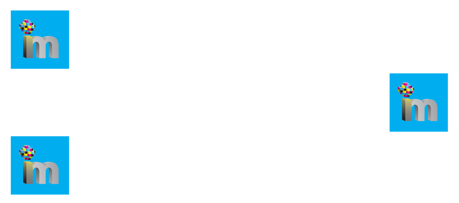
Ideal Media Group, LLC
Ideal Media Group was a B2B custom publisher of multiple titles, web portals and various live events. Although they did have print publications, there was also a heavy online focus which I wanted to incorporate. By using the traditional CMYK colors and transforming them into pixelated blocks, I felt it brought the two together.
•Logo design and development
•Letterhead/business cards/envelopes
Modern Builder + Design
This was one of my favorite titles to develop and set style for. As an oversized print publication, it allowed for large imagery and ample use of white space while selectively positioning the text on each spread. When creating the logo, I wanted it to have prominence, however, I did not want it to feel too heavy. Creating a transparency effect allowed it to be a dominant element on the cover without overpowering the imagery. The use of bright colors throughout step off the page and amplify the photography.
•Logo design and development
•Magazine design and development
Chemical Executive Magazine
Although this magazine title never came to fruition, it was extremely fun to work on the design concepts for it. The title itself was kept clean and easy to read at a glance. All of the titles this publisher produced were focused on reaching the executive level and therefore had 'executive' in their name. I had fun with this one using some of the letters from the periodic table as well as using one of the letters not found on the table to highlight the issue and date of the publication.
•Logo design and development
•Magazine design and development